I first read Limits To Growth sometime around 1982. Limits used computer models to predict possible futures of resource use, pollution and population over-shoot.
At the time I thought it was right, and everything since then has come in about as it said.
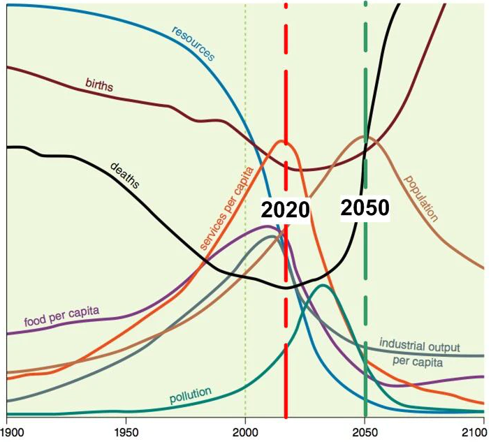
The chart’s a couple years off, but notice that we’re hitting the food per capita just a few years after it expected. You can say “this is because of the Ukraine war” but we were at the stretching point, which is why one war (and a bunch of stupid sanctions) were able to do this.
Note that services and industrial output are expected to peak around the same time. Population starts dropping in about 20 years and the death rate goes vertical about the same time.
Notice how extreme the declines and rises are once they get going. This should be familiar to people from the Covid pandemic, but these trends will last for decades; indeed for generations.
I’m not sure I entirely buy the population model. It’s based on the fact that poor people have more kids, with some delay, but I think the one things the Club of Rome didn’t entirely take into account is how bad climate change and ecological collapse will be.
The point, now, is that we’re about at the peak or slightly past it. The collapse has started. Covid and Ukraine pushed us into it, but it was going to happen anyway, and there’s always an inciting event. What has changed is that there was no slack in the system (and no competence, with the single major exception of China) to deal with it.
The second point is, again, how sharp these declines become, often almost immediately after they start.
Food isn’t going to get cheaper almost anywhere for a while. Then what will happen is that multiple countries which have surpluses will disconnect from the world supply network so they can feed their own people. This won’t be done for humanitarian reasons at home, our elites don’t have such feelings, it will be done because food shortages are the fastest route to revolution, and that includes food shortages caused by too high inflation. If the food’s out there any can’t afford it, it amounts to it not being out there.
This chart doesn’t break out water specifically, but in a lot of places water is going to be in serious shortage. We’re going to lose a lot of river flow and a lot of rivers and lakes outright, because they are fed by glaciers and snow pack which are already in precipitous decline. In some cases there will be an increase before the decrease: floods and so on caused by more water flow as glaciers melt faster, but then there will be almost none.
In many regions there’ll be more rain and there’ll be more rain overall, but it’s not going to make up for the lost river flow and lakes, or for the aquifers we have drained or poisoned.
This is the map, it may be off in a few places, but it’s going to be essentially correct. It didn’t have to be, the book was published as a warning so we could change our ways, but we didn’t and so it’s turned from possible prediction into prophecy.
Come back to this chart over and over again as you think about and plan for the future, but remember that it is a global chart: local areas will have different profiles and charts especially as we de-globalize, and in response to this collapse we are going to de-globalize with a vengeance.
There are certain places you just don’t want to be, which will get hit earlier and harder. In the US, much of the Southwest and south (Texas, for example.) In Asia: Bangladesh in the first wave, then India soon thereafter. I don’t know Africa well enough, but the same regional effects will occur there.
On the human scale there will be mass migrations, refugee waves of tens to hundreds of millions and war over water and arable land. Multiple societies will collapse into warlordism.
This is the future.
Our future.
