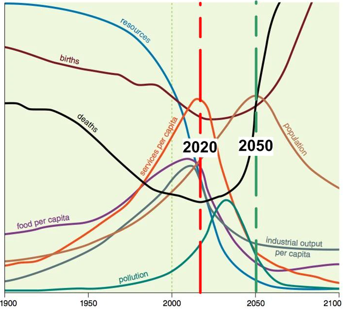
I spent a fair bit of time staring at this graph yesterday, and I want to return to it, because it says some very important things about what’s coming up over the next decades.

The first thing to understand is that the future is, as William Gibson has noted, unevenly distributed. Sri Lanka is currently all-out collapse, for example.
The chart above is GLOBAL. Regional charts will be similar, but not identical and the time axis will differ. Some regions will collapse slower, peak later and so on.
The first thing I want you do is find the population line. Notice that it peaks in 2050.
Now, find the services per capita line. Peaks about 2020.
Now, the industrial output per capita. Also peaks about 2020.
And now look at the food per capita line, same thing.
But it’s not the peak that matters, go back and look at what happens after the peak.
Now, go back to those three lines and see what they do after 2020.
Not quite vertical declines, but very very steep.
Look at the food per capita line now. Go to the very right of the chart, then to the very left.
Somewhat under half the food per capita in 1900 will be produced in 2100. Move back a little and you’ll see it actually bottoms around 2060, then slowly recovers.
All three of the production lines have precipitous declines. The industrial production line manages best, winding up around a 1950 number, but remember that most of the world was not industrialized back then, just Europe, Japan, and North America. This is a world number. Next, consider the primary industrial nation today is China: don’t assume that it’s Europe and North America who will necessarily be the one with the big chunk of the remains: it isn’t going to be just a reversion to 1950 (especially considering the food collapse.)
Services come off the worst: services are, in most cases, luxuries. If we want to keep the important services like health care and education we’re going to have to prioritize them and be ruthless about cutting service crap we don’t actually need.
As for the good stuff, pollution peaks around 2035 in this model. Sounds promising and it is, but the problem is that we will be past self-reinforcing cycles at that point: methane release from permafrost for example, so climate change will continue. And as people become desperate for food, and they will, every wild animal, including the fish, and anything else edible will be plundered, so ecological collapse will continue and even accelerate.
Population doesn’t peak till 2050 in this model. Look down to the food line and you’ll see that food per capita recovers when population declines. In part this indicates a semi-permanent change in the Earth’s carrying capacity: some will recover, over time, but for a long time it just won’t be able to produce as much food for us.
Now, flip over to the death line. It goes vertical in the 2040s. Of course, the Club of Rome couldn’t model Covid, so I suspect we may get there earlier and the plague may help a number of these lines be somewhat better, ironically.
But do notice that when the death line goes vertical, it’s damn near at 90 degrees. A LOT of people are going die.
The population, death and birth lines indicate that deaths are driving the population decrease. I’m hoping that the births line is wrong, it goes vertical not long after the deaths line and that’s why the food per capita numbers remain abysmal. If we want to have even semi-decent conditions for most people we’re going to need decreasing population for quite some time. I’ve seen estimates that the world carrying capacity may crash as much as 80%. Hopefully it won’t be that bad, but if most of the tropics are uninhabitable we’re in a world of hurt and every estimate I’ve seen is that climate change takes away far more agricultural land than it creates farther north.
All of that before we get to the permanent damage done to our supplies of fresh water, which is a definite limiting factor. Even if we make desalinization work, well, there’s a lot of land that’s nowhere near the sea.
This is a chart you should spend time with, till it soaks into your emotional bones. Look at the shape of those curves.
This is civilization collapse. It is going to be very bad, much worse than most people expect.
The collapse has begun, worldwide. It’s not evenly distributed, but it’s here.
We are post peak. Plan accordingly.
